I recently had a discussion with a friend, and we were wondering about Apple's market share. This led me to look into the actual data ... finding the online charts lacking, and then designing my own charts. Follow along if you're curious about the process of improving the charts, or jump to the bottom if you just want to see the results...
But first ... what phone do I use? I'm a bit old-school, and I still use an old LG Decoy slider phone (released in 2008). I'll probably have to upgrade soon, because Verizon has started removing their old/3G network, and I'm starting to get worse and worse reception (whereas I used to bet better reception than most smartphones). Will I finally get a smartphone? ... Nope - I'll probably get a 4G flip-phone! 🙂

The Original Graphs (not mine!)
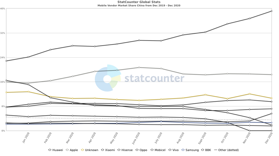
I found mobile phone market share graphs on the statcounter website. They had a fairly simple interface. Below the graphs, they had big buttons used to select view criteria for the graph, such as a location (e.g. country, continent/region) and a year. Below is an example of their 2020 plot for China. Overlaying multiple lines like this is a good way to compare values, but I'm more interested in seeing "the mix" of vendors, and how that changes over time. Which one of the lines in this graph is Apple, and how has it changed over the years? ... Not so easy to determine from their graph, is it?
The Data
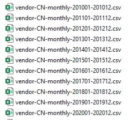
So ... I decided to create my own graph (not surprising, if you know me!) And thankfully the statcounter website allows you to download the data. There's a "Download Data (.csv)" link at the bottom of each graph. But since each graph only shows one year of data, I had to browse to several different annual graphs, and download a separate CSV file for each year, to get the range of years I wanted (2010-2020). I downloaded 11 CSV files for each of the following: China, Europe, South America, and the United States. Below is a screen-capture of the names of the China CSV files, for example:
I used the following code to import a single CSV file, and I wrote a macro to loop through all the CSV's for all the areas and combine them into one dataset (the '&loc' and '&year' are passed in as macro variables):
filename moblcsv "mobile_data/vendor-&loc.-monthly-&year.01-&year.12.csv";
proc import datafile=moblcsv out=tempdata dbms=csv replace;
getnames=yes;
guessingrows=all;
run;
My Preliminary Graphs:
Rather than lines, I want to use stacked bar chart segments to represent each vendor's monthly share. Here's the basic code I used for my preliminary try, and the (default) graph it produced. Note that there is a date for each monthly stacked bar, which makes it a bit cluttered along the bottom axis. There are also many vendors with a small percentage of the monthly share, which causes the color legend to be cluttered.
proc sgplot data=my_data;
vbarparm category=date response=market_share /
group=vendor groupdisplay=stack;
run;
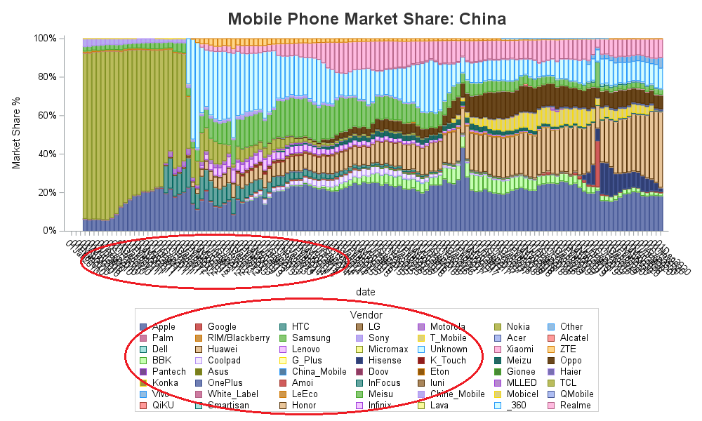
To make the graph more readable, I wanted to get rid of some of the smaller vendors, and also thin the date values along the bottom axis. Therefore I pre-summarized the data (creating market_share_sum) and put any monthly vendor value less than 3% into an 'Other' category (vendor_modified). And I used the xaxis type=linear option so the graph would treat the dates as a linear time axis, rather than discrete values.
proc sgplot data=plot_data;
vbarparm category=date response=market_share_sum /
group=vendor_modified groupdisplay=stack;
xaxis type=linear;
run;
This made the graph much more readable, but I still wasn't quite happy with the dates that were automatically picked along the bottom axis. The combination of date values and formats, linear axis, and bar charts is a bit tricky. It's easy to control any one of them separately ... but when you try to control them all simultaneously, it can be a bit of a challenge. I finally gave up on using actual 'date' values.
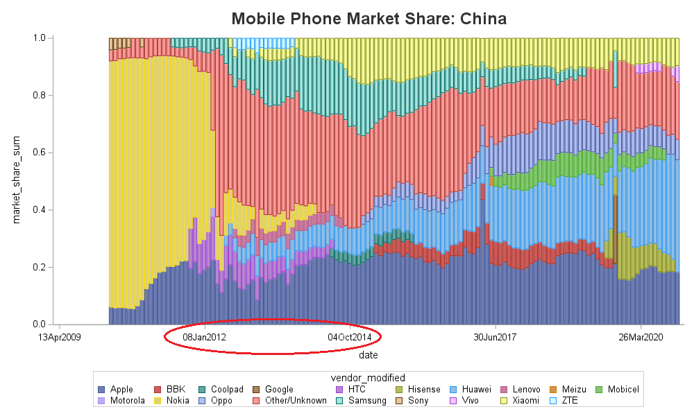
My Final Graph
There are probably multiple ways to accomplish the same end result, but I decided to convert my monthly date values into fractional year values, and then show the even years (for the January bars) along the bottom axis. Here's that code, along with several other little touches I used to create the final graph (click here to see the full SAS code). Below the code are 4 graphs it produces (if you want to see the graphs with mouse-over text, click the graphs to go to the interactive version).
options nobyline;
title1 h=16pt c=gray33 "Mobile Phone Market Share: #byval(location)";
proc sgplot data=plot_data noborder uniform=group; /* same colors for same vendors in all graphs */
by loc location notsorted; /* by-values used in title and html anchor name */
format year_decimal comma8.3; /* controls how bars are grouped */
format market_share_sum percent7.0;
vbarparm category=year_decimal response=market_share_sum /
group=vendor_modified groupdisplay=stack nooutline
tip=(year month market_share_sum vendor_modified)
tipformat=(auto auto percent7.2 auto);
xaxis display=(nolabel noline)
type=linear /* bar charts are usually discrete axis */
valuesformat=best8.0 /* overrides the comma8.3 format used for grouping the bars */
values=(2010 to 2021 by 1) /* controls which tick values are shown (default might be by 2 years) */
offsetmin=0 offsetmax=.01;
yaxis display=(noticks noline nolabel) offsetmax=0;
/* use refline instead of grid, to get lines in front of bars */
refline 0 .20 .40 .60 .80 1.00 / axis=y lineattrs=(thickness=1 color=blue pattern=solid);
keylegend / title=' ' position=right noborder sortorder=descending;
run;
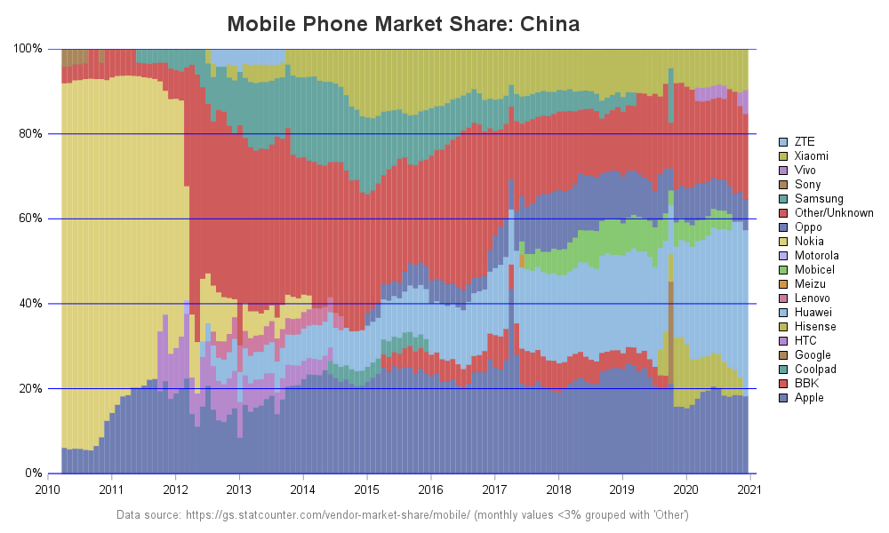
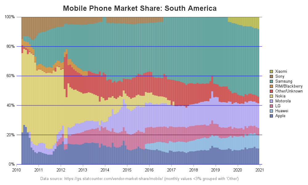
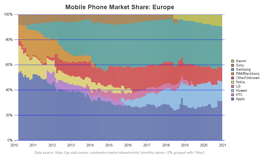
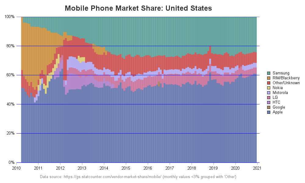
Any surprises in this data? Do you have any insight into why certain vendors are/aren't popular in various parts of the world? What's your prediction for the next few years? Feel free to share your thoughts in the comments!

4 Comments
Hi Robert, The stack bar has some advantages. However it is hard to see what the market share is for any other vendor than Apple. Individual lines make this easier. But will always be cluttered. Maybe and ide is to use lines and use panels by vendors, after creating the other vendors category. Or make a drill down to a line/table from the stackbar graph.
I guess it all depends on what you want question you want to answer from the data. These stacked 100% bars are more about showing the 'mix' rather than the values. But if you want to see individual values, you can hover your mouse over the bar segments to see the individual values in the mouse-over text.
There are a lot phone name in legend.
If put these phone name in graph ,that would be more readable.
Like mosaic plot in proc freq.
ods graphics on;
proc freq data=sashelp.cars ;
table origin*type/plot=(mosaic);
run;
Yes, I always recommend looking at data in several different ways. A mosaic plot would be a different way of showing this data ... but it wouldn't show how the mix changed over time, which is what I was especially wanting to see.